UI / UX Design
Lucid
Web Homepage Redesign UX Case Study
Year :
Spring 2022 - Fall 2022
Tools :
Lucidchart , Adobe XD, InVision, Google Forms, Adobe Illustrator
Role:
UX Design/Research, Visual Design, Mapping, Wireframing, Prototyping & Testing
Preface
Preface
This project started with a small frustration back in a 2021 software engineering class. My classmates and I were trying to use Lucidchart through our school license, but when we landed on the Lucid homepage, we couldn’t figure out where to log in or how to access it. The page was very marketing‑focused, and nothing guided new or student users. That moment stuck with me, and it’s what led me to explore how the homepage and navigation could better support people who are visiting for the first time.
Problem
First‑time users had trouble figuring out how to get started with Lucidchart. The login path wasn’t there, and there was no clear guidance for students trying to access a school license. The navigation also felt inconsistent as some pages showed two different headers, and the homepage’s visual hierarchy didn’t point new users toward a clear next step. All of this created unnecessary friction for anyone trying to enter the product for the first time.
Goal
My goal was to make Lucid’s homepage and navigation easier for first time users to understand. I focused on simplifying the navigation, improving the visual hierarchy, and adding clearer entry points such as a dedicated banner for students. The aim was to help new users quickly find where to log in and how to get started.
The process

hypothesis
hypothesis
If the homepage offers a clearer login path and a dedicated entry point for students, first time users will be able to access Lucidchart more quickly and with less confusion.
“I want to use a product, but I also want to know how their website looks. The website is the first thing people notice.”
understanding the product & market
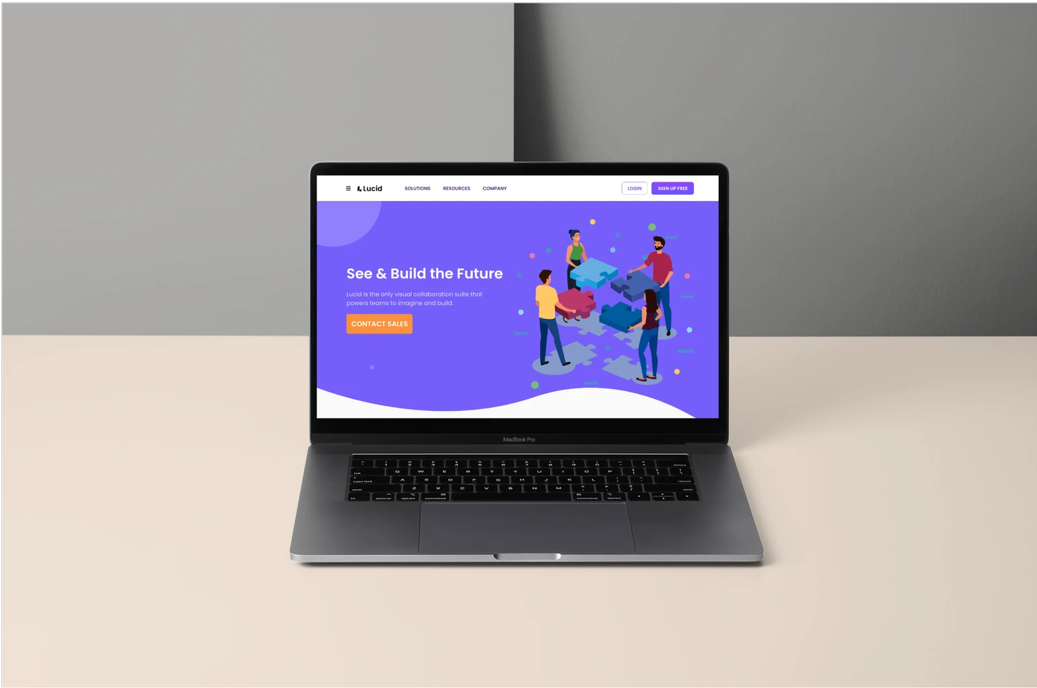
In 2021, Lucid’s homepage was designed mainly for enterprise buyers. Most of the content focused on product promotion, sales messaging, and feature highlights. This made sense for their business goals, but it did not offer much help for first time users who simply needed to log in or access an existing license. As a student trying to use a school license, this created a clear gap between what I needed and what the homepage communicated.
Pain points
Through my own experience and a light heuristic review, I identified three areas where the homepage and navigation created friction for first-time users.
1. The login path was not easy to find
The homepage focused on product promotion, which made it difficult for new users to see where to log in or access an existing license. This was especially challenging for students using a school account.
2. Navigation felt inconsistent across pages
Some product pages showed two different navigation bars. This made it unclear which menu to use and added unnecessary cognitive load.
3. The homepage did not guide new users
The visual hierarchy emphasized marketing content instead of helping visitors understand how to get started. There were no cues for students or first time users who needed a simple entry point.
Why these pain points mattered
These issues made it harder for first time users to understand how to get into the product. As a student trying to access a school license, I needed a clear starting point, but the homepage did not support that. This gap shaped the direction of my redesign.

Design Approach & Usability Testing
I focused on small but meaningful changes that would make the homepage and navigation easier for first time users to understand. I tested the original site with ten participants across three user types to see where people got stuck.
1. Users couldn’t find the login path
Participants immediately looked for a login option and were confused when the only visible action was “Contact Sales.” Two common reactions were:
“Where is the login option”
“I cannot find the login button”
2. The navigation felt overwhelming & inconsistent
After clicking into a product, users encountered a second navigation bar and a crowded multi column dropdown. The active state was hard to see, and some items appeared twice. Participants said things like:
“Why are there two navigation bars”
“There are so many dropdowns”
3. A banner made the starting point obvious
Participants immediately understood where to begin when a small banner was added below the navigation. All ten users were able to find the correct starting point without hesitation.
4. Additional insights
Users also wanted pricing on the homepage and a clear note that the product is free for students. These small details helped them feel more confident they were in the right place.

Key Decisions
Based on what I learned from testing the original experience, I focused on a few targeted changes that would make the homepage easier for first time users to navigate.
1. Add a clear starting point for new users
Participants struggled to find the login path, so I added a simple banner below the navigation that directed new users to the correct setup page. This created an immediate and visible entry point.
2. Reduce confusion in the navigation
Users were unsure which navigation bar to follow after clicking into a product. I explored ways to make the primary navigation more consistent and remove competing actions that added unnecessary noise.
3. Improve the homepage hierarchy
The original homepage emphasized marketing content, which made it harder for new users to understand what to do next. I adjusted the layout so the login path and banner were more visible and easier to find.
IDEATION
User Research
I conducted user research with students who had used Lucidchart before. My goal was to understand where first-time users get stuck and how clearly the homepage communicates the correct starting point.
Light usability testing to observe how quickly users found the login path
A/B testing comparing Lucid and Miro to understand expectations around navigation and hierarchy
Heuristic review to identify issues with visibility, consistency, and overall clarity
Early Concepts
After seeing where users got stuck, I explored a few quick ideas to make the starting point clearer. I tried simple visual changes that highlighted the login path without altering the entire layout, but these early sketches also reminded me not to jump straight into design before understanding the system constraints.
Tried a purple button pair (outline Login and solid Sign Up Free) to test visibility and hierarchy
Added a dark green banner to see if stronger contrast helped first time users notice the correct starting point
Realized that bold color changes solved visibility issues but didn’t align with Lucid’s design system, which pushed me to refine the final direction

Final Redesign
I refined the early ideas into a cleaner, high fidelity redesign that gives first time users a clear place to start while staying true to Lucid’s brand colors.
Used Lucid’s brand colors for the final banner
Added a clear starting point for new users
Improved the visual hierarchy
Kept the overall layout familiar

Key Decisions
I focused on changes that improved clarity without altering the overall layout. The goal was to make the homepage easier to understand and give new users a clear place to start.
Added a banner to guide first time users
Clarified the login path
Simplified the navigation
Improved the overall scan pattern
DESIGN
1. Homepage Redesign
The updated homepage introduces a clear banner that guides first time users to the correct starting point. The login path is easier to find, and the navigation feels more consistent with Lucid’s design system.

2. Navigation Improvements
I refined the navigation to make it easier to scan and more consistent across pages. The updated labels, spacing, and sticky positioning reduce cognitive load and help users move through the product without relying on trial and error.
3. Improved Student Access Visibility
I clarified the student access entry point so it no longer gets lost in the page. The updated placement and visual hierarchy make it easier for students to recognize where to begin, and the green accent reinforces that this path is safe and intended for them.

Before & After
A simple before and after comparison highlights how the redesign improves clarity without changing the overall layout.

FINAL WIREFRAME
This is the mid‑fi version of my final design. I didn’t move this into high fidelity because the improvements were structural, not visual.
PROTOTYPE 1.0
This was the first high‑fi version I explored. Once I tested it with users, it became clear that a lot needed to change, so I moved in a different direction.
Click the image to view prototype 1.0

project learnings
This project helped me see how much clarity can come from small, intentional changes. It also reminded me how important it is to stay close to the research instead of relying on assumptions.
Even quick, lightweight research showed what users expect from a modern SaaS homepage.
Improving the visual hierarchy and simplifying navigation had the biggest impact on clarity and trust.
Checking back in with my research kept me grounded and prevented assumption‑driven decisions.
Working within constraints pushed me to focus on changes that genuinely improved the first‑time user experience.
Note: This project reflects my early UX thinking in 2021/22. I approached the redesign from the perspective of a first‑time student user who encountered real friction while trying to access Lucidchart through a school license. While my skills and understanding of UX have grown since then, I’ve kept the core decisions and reasoning and show how I identified issues, validated hypothesis, and made improvements based on the context I had at the time.
More Projects


UI / UX Design
Lucid
Web Homepage Redesign UX Case Study
Year :
Spring 2022 - Fall 2022
Tools :
Lucidchart , Adobe XD, InVision, Google Forms, Adobe Illustrator
Role:
UX Design/Research, Visual Design, Mapping, Wireframing, Prototyping & Testing
Preface
Preface
This project started with a small frustration back in a 2021 software engineering class. My classmates and I were trying to use Lucidchart through our school license, but when we landed on the Lucid homepage, we couldn’t figure out where to log in or how to access it. The page was very marketing‑focused, and nothing guided new or student users. That moment stuck with me, and it’s what led me to explore how the homepage and navigation could better support people who are visiting for the first time.
Problem
First‑time users had trouble figuring out how to get started with Lucidchart. The login path wasn’t there, and there was no clear guidance for students trying to access a school license. The navigation also felt inconsistent as some pages showed two different headers, and the homepage’s visual hierarchy didn’t point new users toward a clear next step. All of this created unnecessary friction for anyone trying to enter the product for the first time.
Goal
My goal was to make Lucid’s homepage and navigation easier for first time users to understand. I focused on simplifying the navigation, improving the visual hierarchy, and adding clearer entry points such as a dedicated banner for students. The aim was to help new users quickly find where to log in and how to get started.
The process
hypothesis
hypothesis
If the homepage offers a clearer login path and a dedicated entry point for students, first time users will be able to access Lucidchart more quickly and with less confusion.
“I want to use a product, but I also want to know how their website looks. The website is the first thing people notice.”
understanding the product & market
In 2021, Lucid’s homepage was designed mainly for enterprise buyers. Most of the content focused on product promotion, sales messaging, and feature highlights. This made sense for their business goals, but it did not offer much help for first time users who simply needed to log in or access an existing license. As a student trying to use a school license, this created a clear gap between what I needed and what the homepage communicated.
Pain points
Through my own experience and a light heuristic review, I identified three areas where the homepage and navigation created friction for first-time users.
1. The login path was not easy to find
The homepage focused on product promotion, which made it difficult for new users to see where to log in or access an existing license. This was especially challenging for students using a school account.
2. Navigation felt inconsistent across pages
Some product pages showed two different navigation bars. This made it unclear which menu to use and added unnecessary cognitive load.
3. The homepage did not guide new users
The visual hierarchy emphasized marketing content instead of helping visitors understand how to get started. There were no cues for students or first time users who needed a simple entry point.
Why these pain points mattered
These issues made it harder for first time users to understand how to get into the product. As a student trying to access a school license, I needed a clear starting point, but the homepage did not support that. This gap shaped the direction of my redesign.
Design Approach & Usability Testing
I focused on small but meaningful changes that would make the homepage and navigation easier for first time users to understand. I tested the original site with ten participants across three user types to see where people got stuck.
1. Users couldn’t find the login path
Participants immediately looked for a login option and were confused when the only visible action was “Contact Sales.” Two common reactions were:
“Where is the login option”
“I cannot find the login button”
2. The navigation felt overwhelming & inconsistent
After clicking into a product, users encountered a second navigation bar and a crowded multi column dropdown. The active state was hard to see, and some items appeared twice. Participants said things like:
“Why are there two navigation bars”
“There are so many dropdowns”
3. A banner made the starting point obvious
Participants immediately understood where to begin when a small banner was added below the navigation. All ten users were able to find the correct starting point without hesitation.
4. Additional insights
Users also wanted pricing on the homepage and a clear note that the product is free for students. These small details helped them feel more confident they were in the right place.
Key Decisions
Based on what I learned from testing the original experience, I focused on a few targeted changes that would make the homepage easier for first time users to navigate.
1. Add a clear starting point for new users
Participants struggled to find the login path, so I added a simple banner below the navigation that directed new users to the correct setup page. This created an immediate and visible entry point.
2. Reduce confusion in the navigation
Users were unsure which navigation bar to follow after clicking into a product. I explored ways to make the primary navigation more consistent and remove competing actions that added unnecessary noise.
3. Improve the homepage hierarchy
The original homepage emphasized marketing content, which made it harder for new users to understand what to do next. I adjusted the layout so the login path and banner were more visible and easier to find.
IDEATION
User Research
I conducted user research with students who had used Lucidchart before. My goal was to understand where first-time users get stuck and how clearly the homepage communicates the correct starting point.
Light usability testing to observe how quickly users found the login path
A/B testing comparing Lucid and Miro to understand expectations around navigation and hierarchy
Heuristic review to identify issues with visibility, consistency, and overall clarity
Early Concepts
After seeing where users got stuck, I explored a few quick ideas to make the starting point clearer. I tried simple visual changes that highlighted the login path without altering the entire layout, but these early sketches also reminded me not to jump straight into design before understanding the system constraints.
Tried a purple button pair (outline Login and solid Sign Up Free) to test visibility and hierarchy
Added a dark green banner to see if stronger contrast helped first time users notice the correct starting point
Realized that bold color changes solved visibility issues but didn’t align with Lucid’s design system, which pushed me to refine the final direction
Final Redesign
I refined the early ideas into a cleaner, high fidelity redesign that gives first time users a clear place to start while staying true to Lucid’s brand colors.
Used Lucid’s brand colors for the final banner
Added a clear starting point for new users
Improved the visual hierarchy
Kept the overall layout familiar
Key Decisions
I focused on changes that improved clarity without altering the overall layout. The goal was to make the homepage easier to understand and give new users a clear place to start.
Added a banner to guide first time users
Clarified the login path
Simplified the navigation
Improved the overall scan pattern
DESIGN
1. Homepage Redesign
The updated homepage introduces a clear banner that guides first time users to the correct starting point. The login path is easier to find, and the navigation feels more consistent with Lucid’s design system.
2. Navigation Improvements
I refined the navigation to make it easier to scan and more consistent across pages. The updated labels, spacing, and sticky positioning reduce cognitive load and help users move through the product without relying on trial and error.
3. Improved Student Access Visibility
I clarified the student access entry point so it no longer gets lost in the page. The updated placement and visual hierarchy make it easier for students to recognize where to begin, and the green accent reinforces that this path is safe and intended for them.
Before & After
A simple before and after comparison highlights how the redesign improves clarity without changing the overall layout.
FINAL WIREFRAME
This is the mid‑fi version of my final design. I didn’t move this into high fidelity because the improvements were structural, not visual.
PROTOTYPE 1.0
This was the first high‑fi version I explored. Once I tested it with users, it became clear that a lot needed to change, so I moved in a different direction.
Click the image to view prototype 1.0
project learnings
This project helped me see how much clarity can come from small, intentional changes. It also reminded me how important it is to stay close to the research instead of relying on assumptions.
Even quick, lightweight research showed what users expect from a modern SaaS homepage.
Improving the visual hierarchy and simplifying navigation had the biggest impact on clarity and trust.
Checking back in with my research kept me grounded and prevented assumption‑driven decisions.
Working within constraints pushed me to focus on changes that genuinely improved the first‑time user experience.
Note: This project reflects my early UX thinking in 2021/22. I approached the redesign from the perspective of a first‑time student user who encountered real friction while trying to access Lucidchart through a school license. While my skills and understanding of UX have grown since then, I’ve kept the core decisions and reasoning and show how I identified issues, validated hypothesis, and made improvements based on the context I had at the time.
More Projects
UI / UX Design
Lucid
Web Homepage Redesign UX Case Study
Year :
Spring 2022 - Fall 2022
Tools :
Lucidchart , Adobe XD, InVision, Google Forms, Adobe Illustrator
Role:
UX Design/Research, Visual Design, Mapping, Wireframing, Prototyping & Testing
Preface
Preface
This project started with a small frustration back in a 2021 software engineering class. My classmates and I were trying to use Lucidchart through our school license, but when we landed on the Lucid homepage, we couldn’t figure out where to log in or how to access it. The page was very marketing‑focused, and nothing guided new or student users. That moment stuck with me, and it’s what led me to explore how the homepage and navigation could better support people who are visiting for the first time.
Problem
First‑time users had trouble figuring out how to get started with Lucidchart. The login path wasn’t there, and there was no clear guidance for students trying to access a school license. The navigation also felt inconsistent as some pages showed two different headers, and the homepage’s visual hierarchy didn’t point new users toward a clear next step. All of this created unnecessary friction for anyone trying to enter the product for the first time.
Goal
My goal was to make Lucid’s homepage and navigation easier for first time users to understand. I focused on simplifying the navigation, improving the visual hierarchy, and adding clearer entry points such as a dedicated banner for students. The aim was to help new users quickly find where to log in and how to get started.
The process
hypothesis
hypothesis
If the homepage offers a clearer login path and a dedicated entry point for students, first time users will be able to access Lucidchart more quickly and with less confusion.
“I want to use a product, but I also want to know how their website looks. The website is the first thing people notice.”
understanding the product & market
In 2021, Lucid’s homepage was designed mainly for enterprise buyers. Most of the content focused on product promotion, sales messaging, and feature highlights. This made sense for their business goals, but it did not offer much help for first time users who simply needed to log in or access an existing license. As a student trying to use a school license, this created a clear gap between what I needed and what the homepage communicated.
Pain points
Through my own experience and a light heuristic review, I identified three areas where the homepage and navigation created friction for first-time users.
1. The login path was not easy to find
The homepage focused on product promotion, which made it difficult for new users to see where to log in or access an existing license. This was especially challenging for students using a school account.
2. Navigation felt inconsistent across pages
Some product pages showed two different navigation bars. This made it unclear which menu to use and added unnecessary cognitive load.
3. The homepage did not guide new users
The visual hierarchy emphasized marketing content instead of helping visitors understand how to get started. There were no cues for students or first time users who needed a simple entry point.
Why these pain points mattered
These issues made it harder for first time users to understand how to get into the product. As a student trying to access a school license, I needed a clear starting point, but the homepage did not support that. This gap shaped the direction of my redesign.
Design Approach & Usability Testing
I focused on small but meaningful changes that would make the homepage and navigation easier for first time users to understand. I tested the original site with ten participants across three user types to see where people got stuck.
1. Users couldn’t find the login path
Participants immediately looked for a login option and were confused when the only visible action was “Contact Sales.” Two common reactions were:
“Where is the login option”
“I cannot find the login button”
2. The navigation felt overwhelming & inconsistent
After clicking into a product, users encountered a second navigation bar and a crowded multi column dropdown. The active state was hard to see, and some items appeared twice. Participants said things like:
“Why are there two navigation bars”
“There are so many dropdowns”
3. A banner made the starting point obvious
Participants immediately understood where to begin when a small banner was added below the navigation. All ten users were able to find the correct starting point without hesitation.
4. Additional insights
Users also wanted pricing on the homepage and a clear note that the product is free for students. These small details helped them feel more confident they were in the right place.
Key Decisions
Based on what I learned from testing the original experience, I focused on a few targeted changes that would make the homepage easier for first time users to navigate.
1. Add a clear starting point for new users
Participants struggled to find the login path, so I added a simple banner below the navigation that directed new users to the correct setup page. This created an immediate and visible entry point.
2. Reduce confusion in the navigation
Users were unsure which navigation bar to follow after clicking into a product. I explored ways to make the primary navigation more consistent and remove competing actions that added unnecessary noise.
3. Improve the homepage hierarchy
The original homepage emphasized marketing content, which made it harder for new users to understand what to do next. I adjusted the layout so the login path and banner were more visible and easier to find.
IDEATION
User Research
I conducted user research with students who had used Lucidchart before. My goal was to understand where first-time users get stuck and how clearly the homepage communicates the correct starting point.
Light usability testing to observe how quickly users found the login path
A/B testing comparing Lucid and Miro to understand expectations around navigation and hierarchy
Heuristic review to identify issues with visibility, consistency, and overall clarity
Early Concepts
After seeing where users got stuck, I explored a few quick ideas to make the starting point clearer. I tried simple visual changes that highlighted the login path without altering the entire layout, but these early sketches also reminded me not to jump straight into design before understanding the system constraints.
Tried a purple button pair (outline Login and solid Sign Up Free) to test visibility and hierarchy
Added a dark green banner to see if stronger contrast helped first time users notice the correct starting point
Realized that bold color changes solved visibility issues but didn’t align with Lucid’s design system, which pushed me to refine the final direction
Final Redesign
I refined the early ideas into a cleaner, high fidelity redesign that gives first time users a clear place to start while staying true to Lucid’s brand colors.
Used Lucid’s brand colors for the final banner
Added a clear starting point for new users
Improved the visual hierarchy
Kept the overall layout familiar
Key Decisions
I focused on changes that improved clarity without altering the overall layout. The goal was to make the homepage easier to understand and give new users a clear place to start.
Added a banner to guide first time users
Clarified the login path
Simplified the navigation
Improved the overall scan pattern
DESIGN
1. Homepage Redesign
The updated homepage introduces a clear banner that guides first time users to the correct starting point. The login path is easier to find, and the navigation feels more consistent with Lucid’s design system.
2. Navigation Improvements
I refined the navigation to make it easier to scan and more consistent across pages. The updated labels, spacing, and sticky positioning reduce cognitive load and help users move through the product without relying on trial and error.
3. Improved Student Access Visibility
I clarified the student access entry point so it no longer gets lost in the page. The updated placement and visual hierarchy make it easier for students to recognize where to begin, and the green accent reinforces that this path is safe and intended for them.
Before & After
A simple before and after comparison highlights how the redesign improves clarity without changing the overall layout.
FINAL WIREFRAME
This is the mid‑fi version of my final design. I didn’t move this into high fidelity because the improvements were structural, not visual.
PROTOTYPE 1.0
This was the first high‑fi version I explored. Once I tested it with users, it became clear that a lot needed to change, so I moved in a different direction.
Click the image to view prototype 1.0
project learnings
This project helped me see how much clarity can come from small, intentional changes. It also reminded me how important it is to stay close to the research instead of relying on assumptions.
Even quick, lightweight research showed what users expect from a modern SaaS homepage.
Improving the visual hierarchy and simplifying navigation had the biggest impact on clarity and trust.
Checking back in with my research kept me grounded and prevented assumption‑driven decisions.
Working within constraints pushed me to focus on changes that genuinely improved the first‑time user experience.