Branding
KU Brand
The University of Kansas brand overhaul and redesign
Year :
Jan 2023 - Apr 2024
Team :
I was one of the product designers among 20+ designers, marketers, and project managers.
Role:
UX Design/Research, Frontend Development, Graphic Design

Preface
Preface
The University of Kansas (KU) launched a major brand refresh, and our team was responsible for updating the brand website to reflect the new identity. I contributed during the design phase, helped with user research, and worked on implementing the redesigned pages. Our goal was to make the brand site clearer, more modern, and easier for KU Communicators and campus partners to use.
Problem
KU introduced a new brand, but the old brand site did not support it. The content was outdated, the visuals did not match the new identity, and KU Communicators had trouble finding clear guidelines and updated assets. Our team needed to bring the new brand to life online. I helped with early design ideas and worked on updating the new logos, typography, and other visual elements so the site could reflect the refreshed brand in a clear and consistent way.
Goal/Solution
Create a brand site that clearly reflects KU’s new identity and makes it easy for people to find the right guidelines, assets, and updated marks.
Our team redesigned the site to match the new brand direction and reorganized the content so KU Communicators could quickly get what they needed. I contributed to early design ideas and helped implement the updated logos, typography, and visual elements across the new pages to keep everything consistent and aligned with the refreshed brand.
The process
User Interviews & Brand Perception Research
User Interviews & Brand Perception Research
I met with Kansans, alumni, students, faculty, and staff to understand how they describe KU and what the brand means to them. I asked open‑ended questions about identity, traditions, and emotional connection, took notes during every session, and synthesized patterns to help the team align the new brand with how people actually see KU.

A/B Testing & Focus Group Usability Sessions
A/B Testing & Focus Group Usability Sessions
I tested early versions of the new brand elements and layout ideas with small focus groups. I watched how people navigated the old site, where they hesitated, and how they reacted to the refreshed identity. These sessions helped us refine hierarchy, simplify language, and choose design directions that felt clearer and more intuitive.
Information Architecture & System Restructuring
I helped reorganize the entire brand site by mapping out what content people needed most and grouping guidelines in a way that made sense. I proposed layout ideas, clarified confusing sections, and worked with designers to translate brand rules into components that were easy to understand and use.
Bringing Everything Together
Once the structure and direction were clear, I worked with designers and another developer to build the full system, implementing new logos, typography, color tokens, spacing rules, and accessibility updates across every page.
The New Brand System
We brought the updated identity into a clearer, more structured system that made KU’s logos, colors, typography, and usage rules easier to understand and apply.
What worked...
Small conversations with Kansans, alumni, students, and staff gave us clearer insights than long surveys. Early design discussions helped us align the new brand direction with what the site needed to support. Updating the visual elements early made the rest of the build smoother and more consistent.

DESIGN: TOWERING TOWARD THE BLUE
New Identity
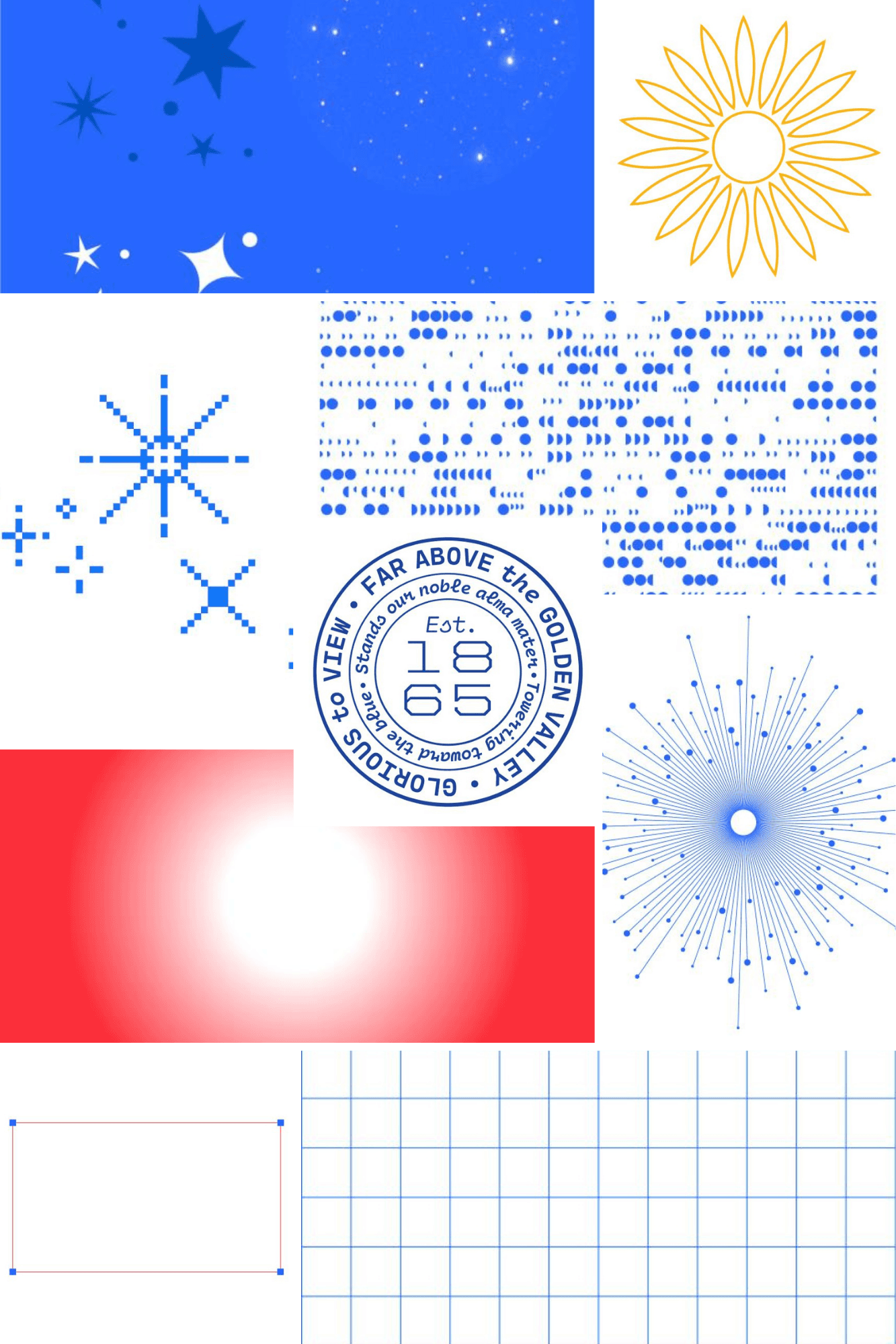
We translated the refreshed KU brand into a digital system by defining how logos, colors, typography, and spacing should appear across the site. This collage shows the core elements we refined and implemented.

Visual System Updates
We spent a lot of time making sure the new brand elements actually worked on the site. That meant adjusting typography scales so they felt balanced, tightening spacing so pages didn’t feel heavy, and cleaning up color tokens so everything stayed consistent. Most of this came from trying things out, seeing what felt off, and making small fixes.
Making The Brand Easy To Use
A big part of my work was reorganizing the brand site so people didn’t have to dig for what they needed. I mapped out the content, grouped things in a way that felt more intuitive, and cleaned up sections that were confusing or outdated. The goal was simple: make the guidelines feel approachable instead of overwhelming.
what didn't work
Surveys didn’t give us the depth we needed. A lot of people rushed through them, so the insights weren’t strong enough to guide a full brand shift.
Many people preferred the old brand. Familiar fonts, colors, and the existing logo felt “right” because of status quo bias and the mere exposure effect.
Some early concepts didn’t connect in testing. Focus groups pushed back on tone, hierarchy, and how certain elements felt in context.
A few layouts didn’t hold up once real users tried them. Things that looked clean in Figma felt confusing or heavy when people actually interacted with them.
A final note
The KU rebrand was a huge, campus‑wide effort with hundreds of people contributing across design, writing, development, and communications. I played a small part in that work, but being involved gave me a real look and experience at how a brand this large comes together and how much collaboration it takes to make it happen.
I am so happy that I got to be a part of this.
More Projects

Branding
KU Brand
The University of Kansas brand overhaul and redesign
Year :
Jan 2023 - Apr 2024
Team :
I was one of the product designers among 20+ designers, marketers, and project managers.
Role:
UX Design/Research, Frontend Development, Graphic Design
Preface
Preface
The University of Kansas (KU) launched a major brand refresh, and our team was responsible for updating the brand website to reflect the new identity. I contributed during the design phase, helped with user research, and worked on implementing the redesigned pages. Our goal was to make the brand site clearer, more modern, and easier for KU Communicators and campus partners to use.
Problem
KU introduced a new brand, but the old brand site did not support it. The content was outdated, the visuals did not match the new identity, and KU Communicators had trouble finding clear guidelines and updated assets. Our team needed to bring the new brand to life online. I helped with early design ideas and worked on updating the new logos, typography, and other visual elements so the site could reflect the refreshed brand in a clear and consistent way.
Goal/Solution
Create a brand site that clearly reflects KU’s new identity and makes it easy for people to find the right guidelines, assets, and updated marks.
Our team redesigned the site to match the new brand direction and reorganized the content so KU Communicators could quickly get what they needed. I contributed to early design ideas and helped implement the updated logos, typography, and visual elements across the new pages to keep everything consistent and aligned with the refreshed brand.
The process
User Interviews & Brand Perception Research
User Interviews & Brand Perception Research
I met with Kansans, alumni, students, faculty, and staff to understand how they describe KU and what the brand means to them. I asked open‑ended questions about identity, traditions, and emotional connection, took notes during every session, and synthesized patterns to help the team align the new brand with how people actually see KU.
A/B Testing & Focus Group Usability Sessions
A/B Testing & Focus Group Usability Sessions
I tested early versions of the new brand elements and layout ideas with small focus groups. I watched how people navigated the old site, where they hesitated, and how they reacted to the refreshed identity. These sessions helped us refine hierarchy, simplify language, and choose design directions that felt clearer and more intuitive.
Information Architecture & System Restructuring
I helped reorganize the entire brand site by mapping out what content people needed most and grouping guidelines in a way that made sense. I proposed layout ideas, clarified confusing sections, and worked with designers to translate brand rules into components that were easy to understand and use.
Bringing Everything Together
Once the structure and direction were clear, I worked with designers and another developer to build the full system, implementing new logos, typography, color tokens, spacing rules, and accessibility updates across every page.
The New Brand System
We brought the updated identity into a clearer, more structured system that made KU’s logos, colors, typography, and usage rules easier to understand and apply.
What worked...
Small conversations with Kansans, alumni, students, and staff gave us clearer insights than long surveys. Early design discussions helped us align the new brand direction with what the site needed to support. Updating the visual elements early made the rest of the build smoother and more consistent.
DESIGN: TOWERING TOWARD THE BLUE
New Identity
We translated the refreshed KU brand into a digital system by defining how logos, colors, typography, and spacing should appear across the site. This collage shows the core elements we refined and implemented.
Visual System Updates
We spent a lot of time making sure the new brand elements actually worked on the site. That meant adjusting typography scales so they felt balanced, tightening spacing so pages didn’t feel heavy, and cleaning up color tokens so everything stayed consistent. Most of this came from trying things out, seeing what felt off, and making small fixes.
Making The Brand Easy To Use
A big part of my work was reorganizing the brand site so people didn’t have to dig for what they needed. I mapped out the content, grouped things in a way that felt more intuitive, and cleaned up sections that were confusing or outdated. The goal was simple: make the guidelines feel approachable instead of overwhelming.
what didn't work
Surveys didn’t give us the depth we needed. A lot of people rushed through them, so the insights weren’t strong enough to guide a full brand shift.
Many people preferred the old brand. Familiar fonts, colors, and the existing logo felt “right” because of status quo bias and the mere exposure effect.
Some early concepts didn’t connect in testing. Focus groups pushed back on tone, hierarchy, and how certain elements felt in context.
A few layouts didn’t hold up once real users tried them. Things that looked clean in Figma felt confusing or heavy when people actually interacted with them.
A final note
The KU rebrand was a huge, campus‑wide effort with hundreds of people contributing across design, writing, development, and communications. I played a small part in that work, but being involved gave me a real look and experience at how a brand this large comes together and how much collaboration it takes to make it happen.
I am so happy that I got to be a part of this.
More Projects
Branding
KU Brand
The University of Kansas brand overhaul and redesign
Year :
Jan 2023 - Apr 2024
Team :
I was one of the product designers among 20+ designers, marketers, and project managers.
Role:
UX Design/Research, Frontend Development, Graphic Design
Preface
Preface
The University of Kansas (KU) launched a major brand refresh, and our team was responsible for updating the brand website to reflect the new identity. I contributed during the design phase, helped with user research, and worked on implementing the redesigned pages. Our goal was to make the brand site clearer, more modern, and easier for KU Communicators and campus partners to use.
Problem
KU introduced a new brand, but the old brand site did not support it. The content was outdated, the visuals did not match the new identity, and KU Communicators had trouble finding clear guidelines and updated assets. Our team needed to bring the new brand to life online. I helped with early design ideas and worked on updating the new logos, typography, and other visual elements so the site could reflect the refreshed brand in a clear and consistent way.
Goal/Solution
Create a brand site that clearly reflects KU’s new identity and makes it easy for people to find the right guidelines, assets, and updated marks.
Our team redesigned the site to match the new brand direction and reorganized the content so KU Communicators could quickly get what they needed. I contributed to early design ideas and helped implement the updated logos, typography, and visual elements across the new pages to keep everything consistent and aligned with the refreshed brand.
The process
User Interviews & Brand Perception Research
User Interviews & Brand Perception Research
I met with Kansans, alumni, students, faculty, and staff to understand how they describe KU and what the brand means to them. I asked open‑ended questions about identity, traditions, and emotional connection, took notes during every session, and synthesized patterns to help the team align the new brand with how people actually see KU.
A/B Testing & Focus Group Usability Sessions
A/B Testing & Focus Group Usability Sessions
I tested early versions of the new brand elements and layout ideas with small focus groups. I watched how people navigated the old site, where they hesitated, and how they reacted to the refreshed identity. These sessions helped us refine hierarchy, simplify language, and choose design directions that felt clearer and more intuitive.
Information Architecture & System Restructuring
I helped reorganize the entire brand site by mapping out what content people needed most and grouping guidelines in a way that made sense. I proposed layout ideas, clarified confusing sections, and worked with designers to translate brand rules into components that were easy to understand and use.
Bringing Everything Together
Once the structure and direction were clear, I worked with designers and another developer to build the full system, implementing new logos, typography, color tokens, spacing rules, and accessibility updates across every page.
The New Brand System
We brought the updated identity into a clearer, more structured system that made KU’s logos, colors, typography, and usage rules easier to understand and apply.
What worked...
Small conversations with Kansans, alumni, students, and staff gave us clearer insights than long surveys. Early design discussions helped us align the new brand direction with what the site needed to support. Updating the visual elements early made the rest of the build smoother and more consistent.
DESIGN: TOWERING TOWARD THE BLUE
New Identity
We translated the refreshed KU brand into a digital system by defining how logos, colors, typography, and spacing should appear across the site. This collage shows the core elements we refined and implemented.
Visual System Updates
We spent a lot of time making sure the new brand elements actually worked on the site. That meant adjusting typography scales so they felt balanced, tightening spacing so pages didn’t feel heavy, and cleaning up color tokens so everything stayed consistent. Most of this came from trying things out, seeing what felt off, and making small fixes.
Making The Brand Easy To Use
A big part of my work was reorganizing the brand site so people didn’t have to dig for what they needed. I mapped out the content, grouped things in a way that felt more intuitive, and cleaned up sections that were confusing or outdated. The goal was simple: make the guidelines feel approachable instead of overwhelming.
what didn't work
Surveys didn’t give us the depth we needed. A lot of people rushed through them, so the insights weren’t strong enough to guide a full brand shift.
Many people preferred the old brand. Familiar fonts, colors, and the existing logo felt “right” because of status quo bias and the mere exposure effect.
Some early concepts didn’t connect in testing. Focus groups pushed back on tone, hierarchy, and how certain elements felt in context.
A few layouts didn’t hold up once real users tried them. Things that looked clean in Figma felt confusing or heavy when people actually interacted with them.
A final note
The KU rebrand was a huge, campus‑wide effort with hundreds of people contributing across design, writing, development, and communications. I played a small part in that work, but being involved gave me a real look and experience at how a brand this large comes together and how much collaboration it takes to make it happen.
I am so happy that I got to be a part of this.